Part 3 - Static Websites
Learning goals
The goal is that after this week, the student will
- Understand what a static website means.
- Understand what HTML is and what it's used for.
- Know what an HTML element is and what it consists of.
- Know what an HTML document consists of.
- Know how to correctly indent HTML and understands the syntax.
- Know how to place elements on a web site.
- Know how to make a simple web page more readable
- Know what CSS is and what it is used for.
- Know how to use the most common features of CSS
- Know how to publish static web pages written with vanilla HTML and CSS
Static websites: HTML ja CSS
The previous parts of the course covered doing several tasks on the command line, and using version control for storing and sharing code. In this part we will use those skills to create simple, static websites. We will start by discussing what static websites actually are, and what they consist of.
To put it simply, a website is a document published on the Internet. The documents accessed via the Internet are located in servers, which are computers allowing users to view them via a browser such as Google Chrome or Firefox. Websites are typically divided into two categories: static and dynamic websites. The content of a static website doesn’t change, unless it is explicitly changed on the server. This means that every user always sees the same content. On the contrary, dynamic pages are created at the same time as the browser accesses a site. This course will only handle static websites, which can be created using a markup language called Hypertext Markup Language, or HTML. You may learn more about dynamic websites later on in your studies.
Setting up
You will need a proper text editor in this part of the course. We recommend using Visual Studio Code, or VSCode for short. In addition, you will need a web browser. Modern, recommended ones include Google Chrome ja Firefox. However, it is also possible to do the exercises using an another text editor and browser.
- Create a Git project called "lapio-website" using the command line.
- Create a new reposiotry to GitHub with the same name.
- Add the newly created repository as a remote of the local project.
- Add a file called
index.htmlto the project, and copy the code from here inside. You don't need to understand the contents of the file yet. - Create a new commit with the message
Osa 3. First exerciseand push it to GitHub.
HTML
HTML is often referred to as a programming language, which is technically not true. It is a markup language, describing the structure of a document. HTML comprises a set of elements and tags used to define and show different sections of the document, also giving them specific functionalities. Tags can for example turn a word into a link, make it cursive, or change its size.
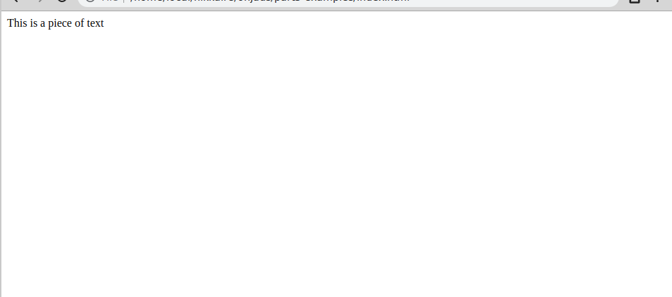
Here is an example of an HTML element:
<p>This is a piece of text.</p>
Let’s look at the structure of the element. An HTML element is composed of three parts:
- The start tag
<p> - The content itself
This is a piece of text - The end tag
</p>
HTML tags are keywords hidden inside the site, but not shown to the end user by the browser. They define how the browser styles and shows the contents of the document the user is viewing. There are countless different HTML tags, each serving to create specific kinds of elements. We’ll start with the elements used to edit text.
<h1></h1>: This tag is used to create heading elements. There are six different heading tags, ranging fromh1toh6. The primary heading is created using the first tagh1. The least important heading is created withh6.<p></p>: The element created with the tagpcontains the body text of the document.<em></em>: The text inside an element created with the tagemis shown in cursive.<strong></strong>: The text inside an element created with the tagstrongis shown in bold. You can also create elements with<b>and<i>to show text in bold and cursive respectively.
Now let’s see how HTML works in practice. We’ll open the file index.html created in the first exercise in a browser and a text editor. You can open the file in the browser by clicking on it in the graphical user interface, or explicitly opening it using a browser program from the command line.
Let’s add the following line in the index.html file just under <!--Do the exercises here-->: <p>This is a piece of text</p>. Then we’ll see what the document looks like in the browser.
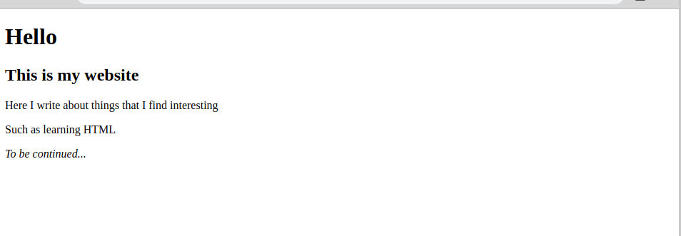
index.html. Test out each of the different text elements and see what they look like. The goal of the exercise is to have the website look like the following:
 After you are done in your opinion, create a new commit with the following message:
 Part 3, add second exercise . Finish by pushing the commit to GitHub.
Nested elements
HTML allows nesting elements, i.e. creating element inside each other. It may help to picture each element as a box which takes care of its own contents. The content could be for example text or images. In addition, one can put other boxes inside a box. This is equivalent to nested elements.
For example, in order to only bold a specific word inside a sentence, one needs to use nested elements. Thus, the following snippet of code
<p>This is a <strong>sentence</strong></p>
will yield the following to the end user:
This is a sentence
However, when using nested elements, it is important to close the tags in the right order. In the previous example we opened the element p first, and the tag strong second. This means that we had to close the element strong first, i.e. the tag we opened the last, and only then close the tag p, which we opened first.
Always close the last tag you opened first. Otherwise the browser will try and guess the correct structure of the document. The site will be rendered even if the elements are closed in the wrong order, but the content will most likely be structured in a bizarre way, depending on the browser.
HTML elements are divided into two distinct categories: block-level elements and inline elements.
Block-level elements are displayed as blocks on the website. Each block-level element takes up a whole line of space, and so the contents are always displayed on a new line. A block element should not be put inside an inline element. An inline element is always found inside a block element.
Inline elements should always be closed inside a block element, while only handling a small part of the document. They shouldn’t contain whole pieces of text or a picture. However, one line can contain several inline level elements. They are usually located inside text. Some examples of inline elements are the tags <strong></strong and <a></a>.
Next we’ll look at block and inline element through an example.
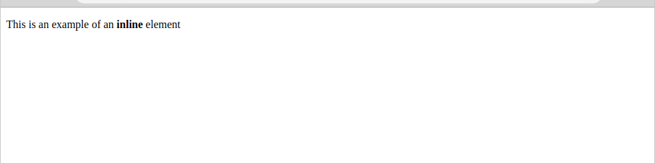
<p>This is an example of an <strong> inline </strong>element </p>
The previous inline element will look like this in the browser:
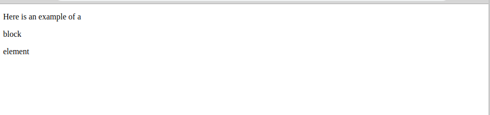
<p>Here is an example of a <p> block</p> element</p>
The previous block element will look like this in the browser:
Nesting elements is an essential feature of HTML, allowing the creation of countless different document structures. Its role will be highlighted even more later on, once we learn how to create styles with CSS.
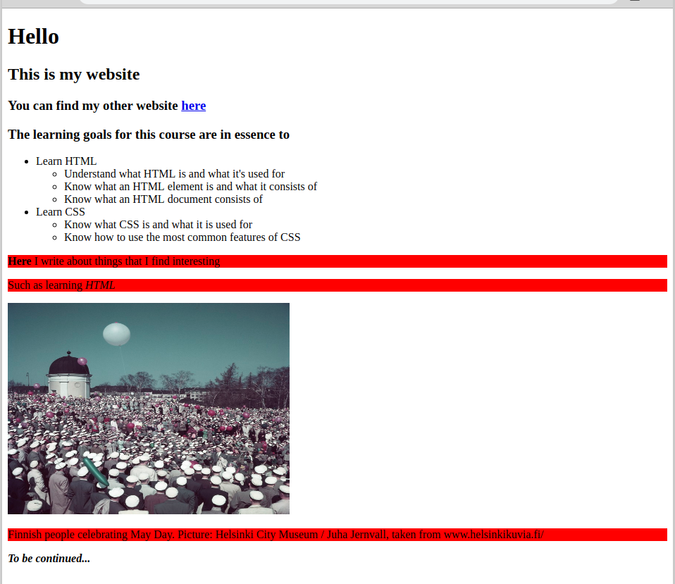
index.html.
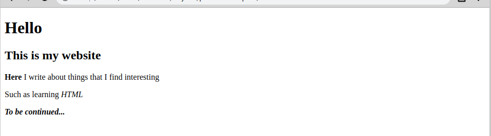
Your task is to make the document inside the file look like the following picture. In other words, bold the word Here, italicize the word HTML, and both bold and italicize the text To be continued....
 After you are done in your opinion, create a new commit with the following message:
 Part 3, add third exercise . Finish by pushing the commit to GitHub.
The structure of an HTML document
Now you know the basics of HTML. However, they are not very useful on their own. Next we’ll dive further into what makes an HTML document.
<!DOCTYPE html>
<html>
  <head>
    <meta charset="utf-8">
    <title>My test page</title>
  </head>
  <body>
    <p>This is my test site</p>
  </body>
</html>
Next we’ll break down the contents of the previous document element by element.
<!DOCTYPE html>: This tag specifies which type of HTML the document is written in, i.e. the rules which the document follows. This way the browser can interpret the HTML properly. The type of HTML used in this course is HTML5. In this case, the first row of an HTML document should always be<!DOCTYPE html>.<html></html>: This tag builds the block element containing all the code of the site. It is sometimes referred to as the root element. It is always the first element of an HTML document.<head></head>: This block element contains metadata, or infromation about the website not shown to the user in the browser. The element may contain for example key words which improving the site’s visibility for search engines, or links to CSS files.<meta charset="utf-8">: This element defines which character set the HTML document uses. UTF-8 is recommended as it can also handle nordic letters.<title></title>: This elements defines the title of the website. You can usually see the title in the browser as the name of the tab of the website. In addition, sites are bookmarked using their title.<body></body>: This block element comprises all the content of the actual webpage, such as text, pictures, and all the elements we have discussed up to this point.
Indenting
An HTML document must be indentend properly in order to make sure the code is readable and clear. Here are some rules you should follow when indenting HTML code:
- Don’t add empty lines without a good reason. For example, if
<h1></h1>is the primary heading and there’s an element built with<p></p>underneath, you don’t need to add an empty line between them. - Alwats indent block elements with two spaces with respect to the previous block.
- Don’t indent inline elements.
Here is an example of a poorly indented HTML document:
<h1>Heading</h1>

<p>Lorem ipsum
<em>dolor sit amet</em>
consectetur adipisicing elit,sed do
<strong>eiusmod tempor</strong>
</p>
Here is the same code indented properly:
<h1>Heading</h1>
<p>
  Lorem ipsum<em>dolor sit amet</em>consectetur
  adipisicing elit,sed do<strong>eiusmod tempor</strong>
</p>
Google has created a great HTML style guide, which you can find here.
In addition, many text editors provide extensions which indent HTML code automatically. For example, in VSCode the extension beautify properly indents the code on each save.
Lists
Next we’ll get to know lists, which is a useful way of storing and displaying information. HTML supports three different kinds of lists: unordered, ordered and nested lists (lists within lists).
An unordered list refers to a list where the order is not significant (hence the name). One example of an unordered list would be a shopping list. In practice, these kinds of lists are shown stacked, separated with bullets. You can create an unordered list with the tags <ul></ul> and <li></li>. Each unordered list starts and ends with the tags <ul></ul>. Each item on the list is inside, in an element created with <li></li>.
The following list:
<ul>
  <li>milk</li>
  <li>break</li>
  <li>candy</li>
  <li>chips</li>
</ul>
will look like this in the browser:
- milk
- break
- candy
- chips
An ordered list is almost identical to the ordered list, with the exception that the order of the items matters. Thus the contents of the list are displayed using incremental numbers. For example, route directions would create an ordered list. The list is created with the tags <ol></ol>.
Here is an example:
<ol>
  <li>Drive to the end of the road.</li>
  <li>Turn to the right.</li>
  <li>Park the car.</li>
</ol>
- Drive to the end of the road.
- Turn to the right.
- Park the car.
Nested lists can combine both ordered and unordered lists. For example, here are some instructions for taking care of a dog:
<ol>
  <li>Take the dog out for a walk.</li>
  <li>Give the dog some food containing:</li>
  <ul>
    <li>150g of cereal</li>
    <li>a splash of oil</li>
    <li>a spoonful of joint powder</li>
    <li>a spoonful of tooth powder</li>
  </ul>
  <li>Fill the water cup.</li>
</ol>
and how the instructions will be shown:
- Take the dog out for a walk.
- Give the dog some food containing:
- 150g of cereal
- a splash of oil
- a spoonful of joint powder
- a spoonful of tooth powder.
- Fill the water cup.
index.html. First, test out the different list types in the document. Then try and make the site look like the following picture:
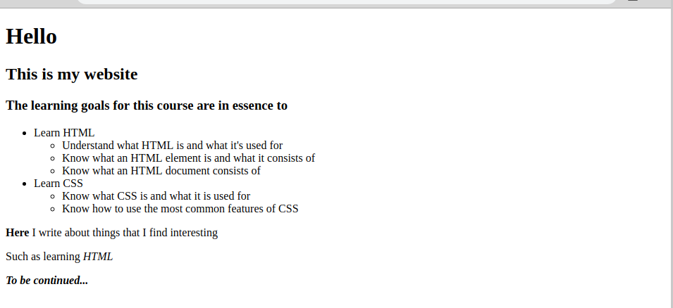 The point of the exercise is simply to add more headings and a few nested lists. Remember to use the heading numbers properly!
When you are done in your opinion, create a commit with the message
The point of the exercise is simply to add more headings and a few nested lists. Remember to use the heading numbers properly!
When you are done in your opinion, create a commit with the message Part 3, add exercise 4 and push it to GitHub.
Images and comments
As the old saying goes, a picture is worth a thousand words. Adding images to a websites can make a big difference in its usability. In order to display an image, it has to be located on some server. One can use the same server where the HTML document is served from, or the image can be linked from elsewhere on the Internet. We’ll start with the latter option.
Images are added to a web page with an element built with the <img/> tag. For example, if we wished to display the image from this address: https://cdn.pixabay.com/photo/2016/02/19/15/46/dog-1210559_1280.jpg, we would use the following element:
<img src="https://cdn.pixabay.com/photo/2016/02/19/15/46/dog-1210559_1280.jpg" alt="Smiling dog" height="240" width="320"/>
There are some new things inside the element, such as alt and height. These are called attributes. Each HTML element can contain attributes. Attributes are used based on the following rule: name="value". That is, in order to define an attribute, you have to write its name inside an element, and give its value as a string.
Attributes provide additional information to an element. In the above example with the image, the src attribute defines the location of the linked image. The attribute alt defines what the image shows (written in a natural language such as English), and height and width determine the size of the image. Out of these four, the src and alt attributes are the most important. Without src, no image would be displayed, and without alt people viewing the page in alternative ways couldn’t know what the image shows. For example, blind people use the Internet with the help of a screen reader, which can then use the contents of the alt tag to describe the picture.
Note how the <img/> element does not have an end tag. It is a so called empty element. This means that the end tag is integrated in the start tag. Empty elements are usually inline elements. You can read more about them here.
If the image is located at the same computer as the website, a relative path can be used for the src attribute.
An HTML document can also contain comments, which will not be displayed to the user in the browser. The point of comments is to clarify the thoughts of the person who has written the code, so that it is easier to interpret by others (and by the developer themselves later on). A comment can be added by writing it between <!-- and -->. For example, <!-- this is a comment -->
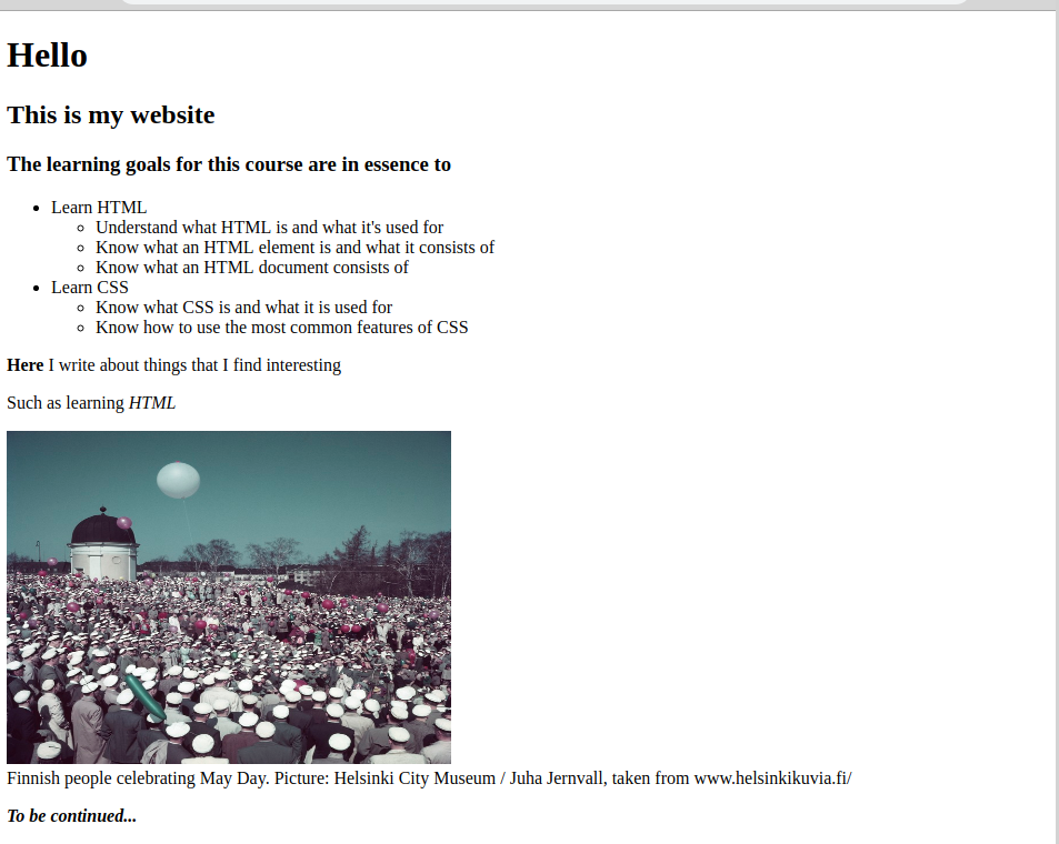
- Find an image you are allowed to use. You can for example use some images from Wikipedia, as long as you comply with the image's license terms. You can also use a picture you've taken yourself.
- Create a new folder to your project, called
assetsand add it to Git. - Add the picture to the newly created folder and to Git.
- Add the image to your web site using a relative path, and add it to Git.
- Adjust the image size as you wish.
- Remember to add the
altattribute. - Write a comment above the image, describing the contents. The comment shouldn't be visible in the browser.
Part 3, add fifth exercise and push it to GitHub.Links
HTML documents can include hyperlinks to other HTML documents. Just like images, a link can point to the same server where the original document is located, or redirect to another server somewhere in the Internet. Links are created with <a></a> elements. They are used in the following way:
<a href="https://yle.fi/uutiset/osasto/news/">Yle news</a>
The link element has an href attriibute, which defines the address of the linked resource. If the linked resource is located on another server, the server address should be written in its entirety. However, if the linked document is located on the same server, one can use a relative path, by for example writing href="page2.html".
The a tag has several other attributes as well. For example the attribute target="_blank" would force the browser to open the resource in a new tab. You can learn more about the different attributes here.
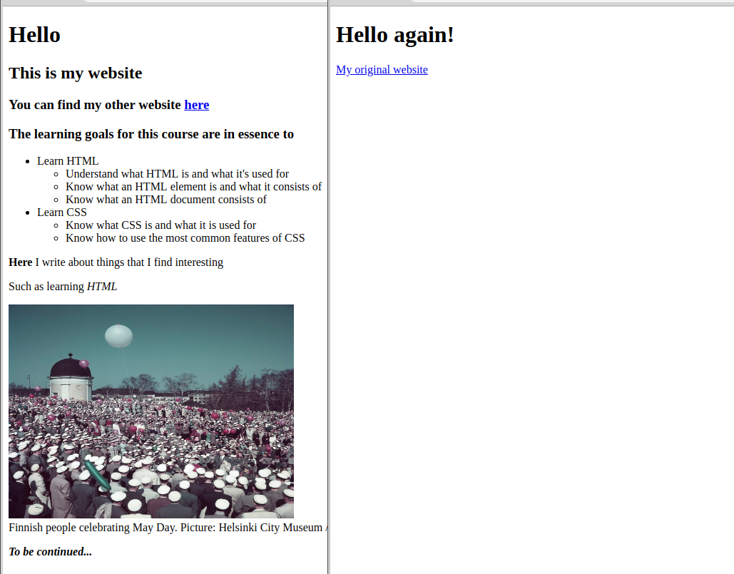
- Create a new HTML document in the same folder as the first one called "index.html".
- Add the new file to Git.
- Create a basic HTML structure to the document. You can reuse the one from the first exercise.
- Link the new document to the
index.htmldocument and vice versa. - Here is an example of what the end result could look like:
- When you are done in your opinion, create a new commit with the message
Part 3, add sixth exerciseand push it to GitHub.
CSS
CSS, or Cascading Style Sheets, is a technique for styling an HTML document. CSS defines how the HTML elements are drawn on the screen. Like HTML, CSS is not a programming language. However, it is not a markup language either. It is in fact a style sheet language instead, which is used to associate styles to HTML tags. For example, with CSS one can paint all the <p></p> elements of a document green with the following block of code:
p {
  color: green;
}
CSS consists primarly of two sections: selectors and properties. Selectors define the elements the styles should be applied to, and the properties describe the styles themselves. In the example above, the lone letter p is the selector. A selector is always followed by a block, outlined with {}, where the desired styles are defined. In the example, color: green is a CSS property. Properties are usually defined using key-value pairs.
Linking CSS
In order to use CSS to influence the styles of an HTML document, it has to be linked to the HTML document. The link to the CSS file should be given in the <head></head> element, where the document’s metadata is located:
<head>
  <link rel="stylesheet" href="style.css">
</head>
Note that there is a new attribute in the link above. The attribute rel tells the browser that the link is to a stylesheet. Thus the browser knows that it needs to read that file and use its contents when rendering the page.
- Create a new CSS file called
style.cssto the same location with the previous files. - Add the new file to Git.
- Add the following style to the CSS file:
p { background-color: red; } - Link the CSS file to the initial HTML document,
index.html, so that the result is the following:
 When you are done in your opinion, create a commit with the message
 Part 3, add seventh exercise and push it to GitHub.
Alternative ways of adding CSS styles
There are also other ways of adding styles besides linking a whole CSS file with a link element in the head of an HTML document.
Inline CSS
Inlince CSS is a good way of defining the styles of individual elements. In practice, the styles are added directly to the style attribute of the desired elements. However, the method isn’t very scalable, and shouldn’t be used on any even slightly complicated sites.
<h1 style="color:yellow;">This is a yellow heading</h1>
Internal CSS
This method is very close to linking a CSS file. Internal CSS means adding the styles inside a style element in the head of the HTML document, i.e. the same place where one would add the link to the separate CSS file.
  <head>
    <style>
      body {background-color: black;}
      h1   {color: blue;}
    </style>
  </head>
As you probably guessed, using a separate CSS file is often the best option when dealing with several HTML documents, as the one file can be linked to each of them, and thus updating the site’s styles only requires editing one file.
Selectors
Selectors define which elements of the HTML document a specific style should be applied to. One element can match several selectors, which all can have a different effect on the element. On the other hand, one selector can match several elements.
Here is a basic CSS example:
p {
  background-color: red;
}
In the example, p is the selector, and background-color: red; us the CSS property. The selector is always written at the beginning of a line, and it is followed by a block containing the properties, which will be used to change the appearances of the elements matched by the selector.
Here are the four most common types of selectors:
Type selectors
A type selector matches all the elements of a specific type, based on their tags. For example, the following snippet of code
p {
  color: blue;
}
would color all the elements defined with <p></p> as blue. Any HTML tag, such as a and li for example, can be used to define the type.
Class selectors
In order to use a class selector, one must first make alterations to the elements one wishes to style. The elements should be added a class, which is an atrribute defined by the user. These elements can then be matched with the class selector, regardless of the type of the element tag. The name of the class selector can be defined freely, but it should naturally be something descriptive.
Here is an example, where we will color all the lines containing the word “yellow” with the color yellow.
<p>
  <p>Stars are beautiful,</p>
  <p class="yellow">and they look yellow from here.</p>
  <p>I also like flowers,</p>
  <p class="yellow">or actually just the yellow ones.</p>
</p>
.yellow {
  color: yellow;
}
One can also give one element several classes. They should then be separated with a space, as follows:
<p class="yellow last-line">or actually just the yellow ones.</p>
Note how the class selector is preceeded by a dot . in the CSS. This specifies, that it’s a class selector. Without the dot the selector would refer to a tag called “yellow”.
The class selector is possibly the type of selector the most widely used. It overrides the changes made with type selectors, in case the styles of an element have been defined using both. In other words, if in the above example you had also defined a style for all p tags, the desired lines would still appear as yellow, as the class selector is given more emphasis.
ID selector
The ID selector is quite similar to the class selector. The difference is that, contrary to a class selector, an ID selector is designed to be used for only one element at a time. In other words, one ID should only match one element.
The use of an ID selector also requires adding new information to the HTML document edited. The attribute used for defining the name of the ID selector is “id”.
For example, if we wish to color just one part of the whole document red, we could add the desired element the attribute id="red-part":
<p class="body" id="red-part">This text will be red</p>
.body {
  color: yellow;
}

#red-part {
  color: red;
}
Note how it is possible to match an element with a class and an ID selector at the same time. In CSS, the ID selector is defined by starting the selector name with #.
Some people say, that ID selectors are pointless and not to be used. This is definitely an overstatement. However, the ID selector should be used more conservatively than the class selector. For example, the class selector is the right choice for styling several elements in the same way. The styles given with an ID selector override the styles given with a class selector, i.e. in case of conflicts, the element will be styled based on the ID selector.
The universal selector
The universal selector simply means choosing all the elements of an HTML document. It has the least weight, i.e. if an element is given some styles using any other selector, it will override the universal selector. The symbol of the universal selector should be familiar to you from the command line part, where it was used to match several filenames:
* {
  color: green;
}
The selectors discussed above are rather simple, but they will get you a long way. Nevertheless, it is also possible to use more complex selector structures, to for example select elements based on the element they are inside of. You can read more for example here.
index.html we have been working with.
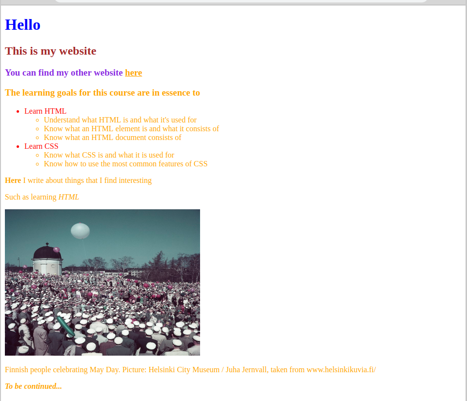
- Don't worry about making the site look pretty - we'll get to that later on - just try out all of the selectors described above. Try and make the site look like the following:
- When you are done in your opinion, create a commit with the message
Part 3, add eigth exercise, and push it to GitHub.
The size, margin, indentation and location of elements
Next we’ll get to know the two probably most commonly used elements in HTML: <div></div> and <span></span>. Both of them are empty shells, meaning that they do not impose a particular style or outlook on the elements they create. The span tag creates an inline element, and the div tag creates a block level element. They are in fact usually used for wrapping groups of elements together. This facilitates adding CSS to a large group of elements, an particularly customizing the layout of a page. Let’s focus on the latter next.
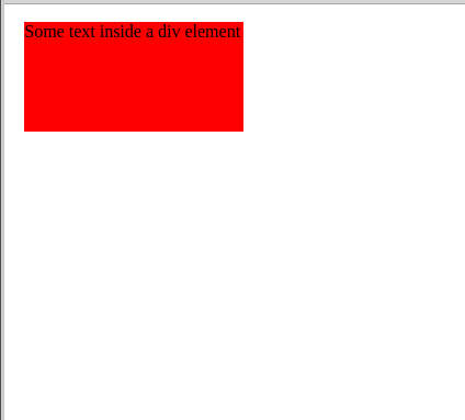
The CSS properties height and width describe, you guessed it, the size of the height and width dimensions of an element. We’ll demonstrate this with a simple div typed element, which contains a p element.
Here are two snippets of HTML and CSS code, linked together:
<div class="container">
  <p>Some text inside a div element</p>
</div>
.container {
  width: 200px;
  height: 100px;
  background-color: red;
}
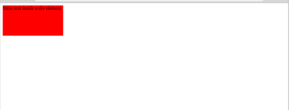
We notice that the CSS above created a red rectangle around the p element. This is due to the fact that we explicitly defined the size, i.e. the widht and the height of the div element, which contains the element with the actual text you see on the website.
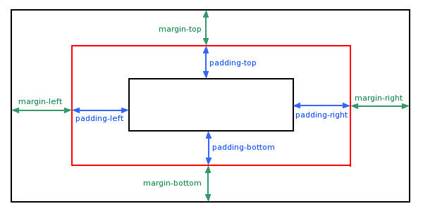
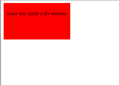
Other useful CSS properties for changing the appearance of a website are padding and margin. In practice, they add some space to the inside or the outside of an element, respectively, according to the following logic:
In other words, adding some margin to the container element would move it away from the borders of the website:
.container {
    width: 200px;
    height: 100px;
    background-color: red;
    margin: 10px;
}
On the other hand, adding some padding to the same element, would actually move the position of the text inside it, as padding adds space inside an element:
.container {
    width: 200px;
    height: 100px;
    background-color: red;
    padding: 10px;
}
There are several different ways to define the value of the margin, padding and other CSS properties. We’ll go through all these different possible ways by using the margin property as an example. The same rules apply to padding, among others.
There are four possible locations for adding margin: the top of the element, the right side of the element, the left side of the element, and finally the bottom of the element. This is the order used to define the margins of different locations in CSS.
It is also possible to define several locations to have the same value:
.container {
  margin: 10px; /* Adds margin to all of the four possible locations (top, right, left, bottom) */
  margin: 10px 5px 15px; /* Top margin is 10px, bottom margin is 15px, and both left and right margins are 5px */
  margin: 10px 5px; /* Top and bottom margins are 10px, right and left margins are 5px */
  margin: 10px 5px 15px 20px; /* Top margin is 10px, right margin is 5px, bottom 15px ja vasenta marginaalia 20px */
  margin-top: 10px; /* Add 10px margin only to the top */
  margin-right: 10px; /* Add 10px margin only to the right */
  margin-left: 10px; /* Add 10px margin only to the left */
  margin-bottom: 10px; /* Add 10px margin only to the bottom */
}
One can also use the attribute auto, which infers the sizes of the margins of an element automatically. For example, the property margin: 0 auto; would center the element horizontally with regards to its parent element (the element which it is inside of). You can read more about using the auto attribute here.
The CSS properties margin and padding will take you far. However, in order to move the elements more flexibly, one needs also the following attributes: position, right, left, top and bottom.
Let’s add two more elements to the example code:
<div class="first-box-container">
  <p>First element</p>
</div>
<div class="second-box-container">
  <p>Second element</p>
</div>
<div class="third-box-container">
  <p>Third element</p>
</div>
.first-box-container {
  width: 200px;
  height: 100px;
  background-color: red;
}

.second-box-container {
  width: 200px;
  height: 100px;
  background-color: yellow;
}

.third-box-container {
  width: 200px;
  height: 100px;
  background-color: green;
}
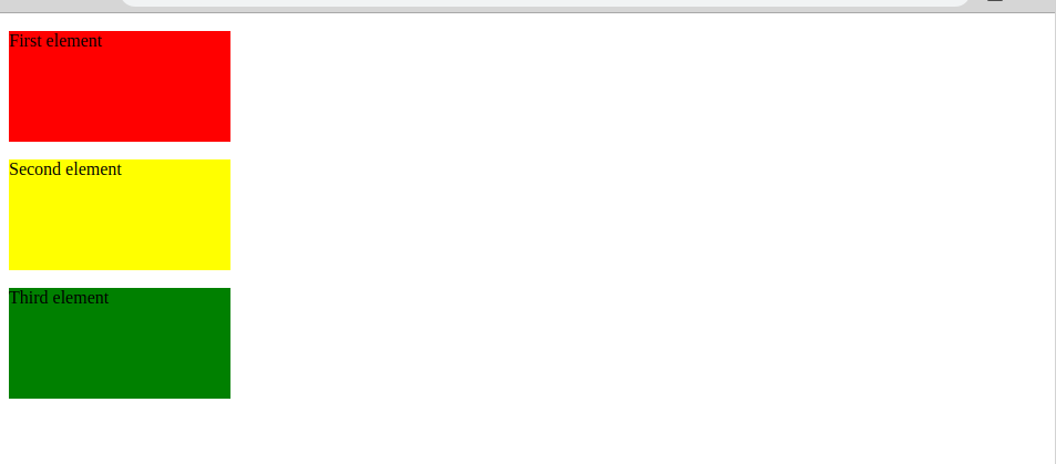
Let’s start by getting to know the property which allows moving elements on a web page.
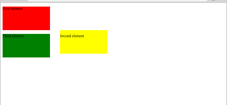
We’ll start by giving the .second-box-container selector the property left: 250px;. This should move the middle HTML element 250px away from the left side of the page:
However, nothing seems to have changed. This is because of the position property, which defines how the location of an element is defined. There are five different values for position in total, of which we’ll handle static, relative and absolute. The default value of position is static, which means that the properties top, bottom, right and left won’t affect the location of the element.
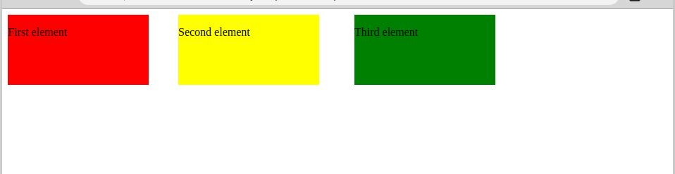
Let’s change the add the property position: relative; for the selector .second-box-container.
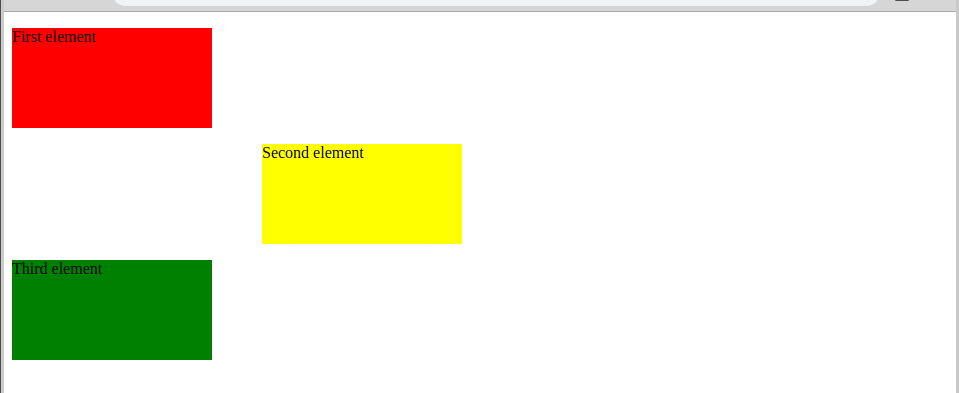
By also changing the value of position, we have managed to move the element as we wished. The value relative doesn’t change the position of the element in the document flow, but allows moving the element with regards to it’s original location.
Next we’ll change the value to absolute and see what happens:
The element is still on the right side of the page, but it no longer reserves space from the original position. This is because position: absolute; deletes the element from the document’s normal flow, meaning that the element is no longer given space in its original location. The element can be positioned with regards to its closest positioned ancestor, or if none is found, the body element.
The position property is often regarded as the one of the most complicated features of CSS. We recommend you read more about it for example from here.
- Create a new file to your Git project, and name it
positions.html. - Create a CSS file and link it to the new HTML file in order to add styles to it.
- Add code to both files in order to create three adjacent elements of different colors on the website, according to the example given above.
- Edit the HTML and CSS code in order to make the website look like the following:
- When you think you are done, create a commit with the message
Part 3, add ninth exercise, and push it to GitHub.
CSS units of measure
In the previous section, we used the unit px for defining the amount of margin and padding of a specific element. Now let’s see, what px actually means and what other units of measure CSS has to offer.
A computer displays images using pixels. Images can be described using the notion of resolution, which means the amount of pixels on a screen. At the moment, the most common resolution is 1366x768, but it can vary between different models and screens. The first value refers to the amount of columns (the x axis) and the second value on the amount of rows (the y axis). For example, here is a representation of the pixels of a screen with a resolution of 1366x768:
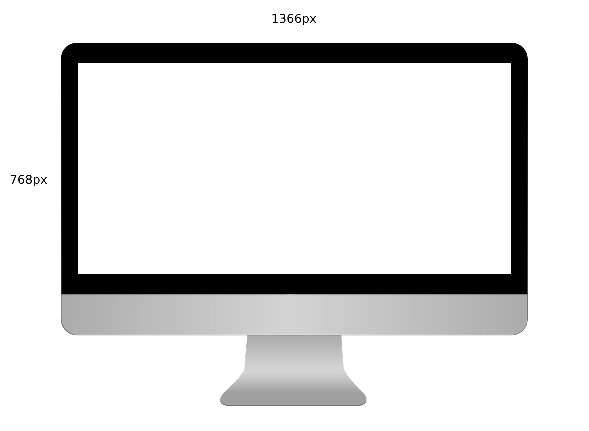
This means that there are over a million pixels on a 1366x768 screen.
Now that we know what an image on a computer screen actually consists of, it is easier to comprehend the units of measure used. We’ll go through the most important units, and then just quickly mention the less common ones.
pxrefers to the amount of pixels used.emdepends on the font size of the parent of the element this unit is used in. Oneemmeans the same font size as the parent of the element. Consequently2emcorresponds to double the font size of the parent element. For example, if the parent element’s font size is12px, then for its child,1emmeans12px, and2emis equal to24px. One should always mark the font size of an element (the property isfont-size) in pixels or inem.%is also defined with regards to the parent of the element. If the width of an element is set to200px, and the width of its child is then defined to be20%, the size of the child will be40px.remis almost equal toem, with the exception that the font size is calculated using the font size of the<html></html>element.vwrefers to the width of the screen.1vwcorresponds to one percent of the screen’s width.vhrefers to the height of the screen. Just like withvw,1vhis one percent of the height of the screen.
In addition to the former units, there are also cm, mm, in, pt, pc, ex, ch, vmin and vmax. You can read more about them here.
The most commonly used properties of CSS
There exists an immense amount of different kinds of CSS properties designed for specific situations, all of which would be impossible to cover completely. However, here is an overview of the most important properties, including what they are used for.
color: #RRGGBB (Red, Green, Blue) allows defining the color of an element using a hex value, or, in the case of the most common colors, in plain English. The definition of a hex value is beyond the scope of this course, but you can read more about it here if you wish. There are also several sites and tools for finding the hex value of a color, such as this one.
text-aling: left [ right [ center [ justify defines which direction the text should be indented to.
text-decoration: none | underline | overline | line-through | blink | inherit enables the most common modifications of text, such as underlining.
text-transform: none | capitalize | uppercase | lowercase enables changing the case of the whole element, regardless if some letters are capitalized or not.
line-height can be used to change the distance between lines. However, the property will only have an effect on text. The values should be given as pixels or percentages.
font-family defines the font of the element.
font-size defines the size of the text. The values should be given in px or em.
font-style allows styling the font further, by for example making it bold or cursive. Nevertheless, bolded text should always be created using <strong></strong> and cursive ones with <em></em>. This is because the screen readers, that for example blind people use, only use the HTML of the page, and thus wouldn’t be able to make the distinction between normal text and text altered with CSS.
background-color adds color to the background of an element. The possible values are the same as for the color property.
border-style defines the type of border of an element. Possible values are solid or dashed.
border-width defines the width of a border, i.e. allows creating bigger, visible borders.
border-color defines the color of the elements’ border. It takes the same values as the properties background-color and color.
- The idea of the exercise is to get to know some CSS properties independently.
- Try and make the site look like the following:
- At this point it doesn't matter that the page is quite ugly, just focus on trying out different properties.
- When you are done in your opinion, create a commit with the message
Part 3, add tenth exerciseand push it to GitHub.
How to improve readibility using CSS
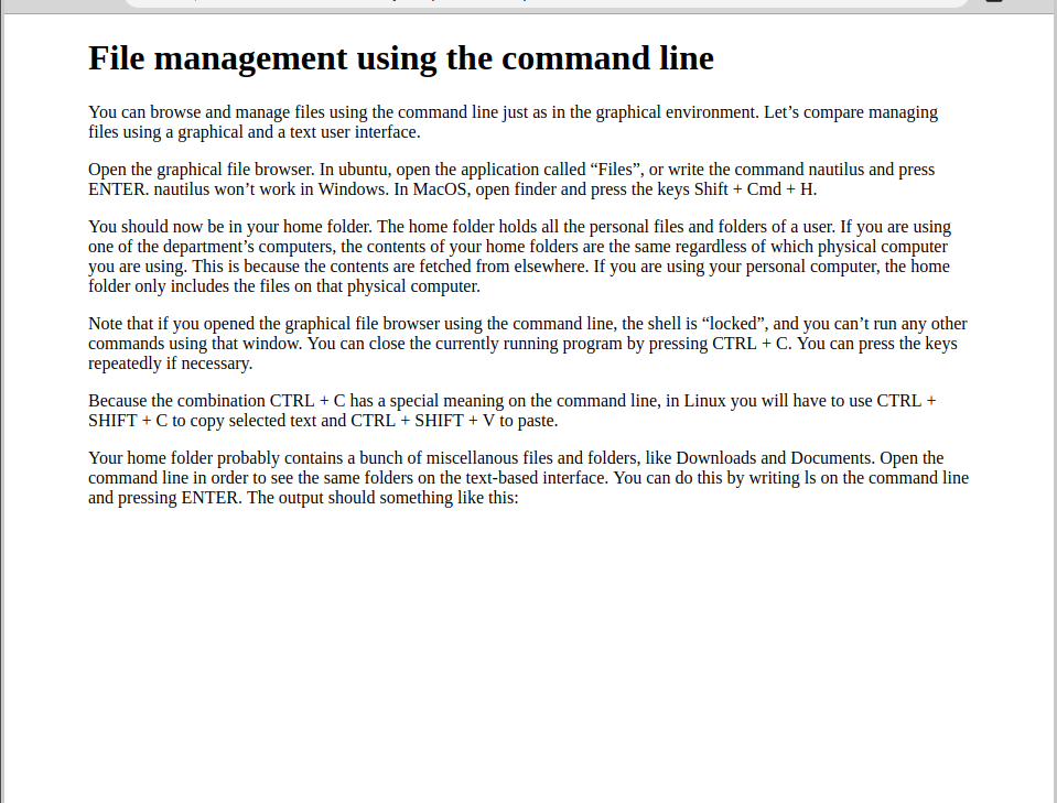
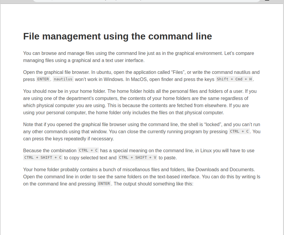
The styles you created in the previous example would be rather uncomfortable to use in real life. Next we’ll see how CSS properties can be used to make sites more clear an easy to use. We’ll use a piece of text, which might be familiar to you:
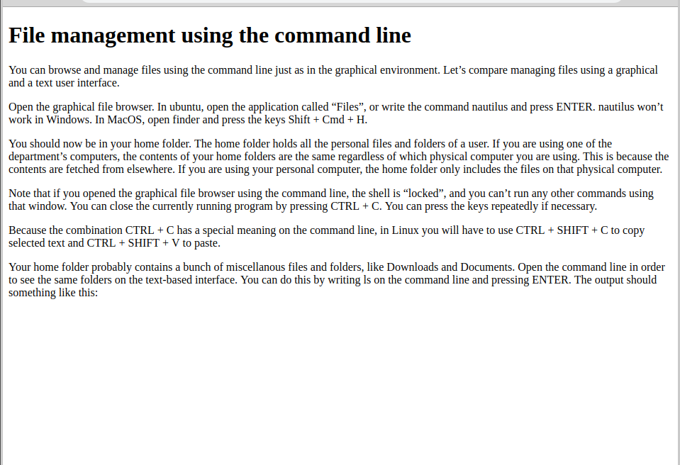
The contents of the page are actually quite hard to read without any CSS. Here is the general structure of the HTML page:
<html>
  <head>
    ...
  </head>
  <body>
    <h1>Command line...</h1>
    <p>You can browse...</p>
    <p>Open the graphical...</p>
    <p>You should now...</p>
    <p>Note...</p>
    <p>Because the combination...</p>
    <p>Your home folder...</p>
  </body>
</html>
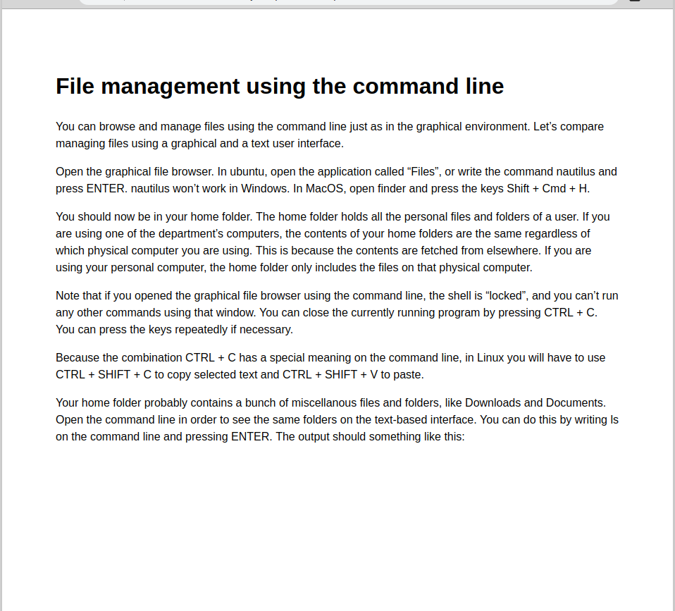
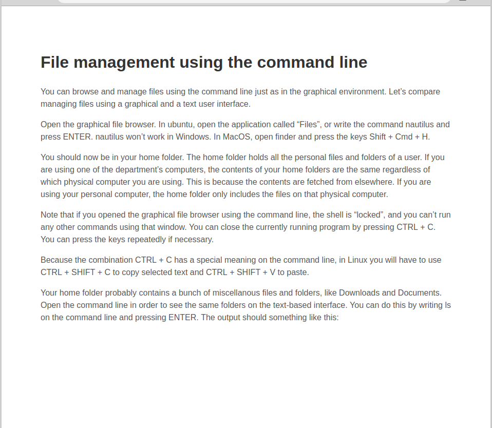
Let’s start by centering the text on the page. This can be done by adding the margin property and the max-width properties to the body tag.
body {
  margin: 0 auto;
  max-width: 50em;
}
The effects of the CSS on the page are the following:
The text is instantly easier to read, as it is in the middle of the screen. However, some improvements can be made still. We’ll focus on the font next. The default font of browsers is called “Times”, but it is not very pleasing to the eye, as the default font is very rarely used. We’ll change the font to sans-serif, which makes the text nicer to read. This can be done by adding the following property to CSS:
body {
  font-family: 'Helvetica', 'Arial', sans-serif;
}
One common reason why text on a computer screen might look a bit awkawrd is because the lines don’t have enough space around them. We’ll add more height to the body tag’s lines, and also add the whole element some space with padding. In addition, we’ll push the title further from the top.
body {
  line-height: 1.5;
  padding: 4em 1em;
}

h1 {
  margin-top: 1em;
  padding-top: 1em;
}
This is a huge improvement in the readibility of the page, but there still is some work to do. One way to make the text easier to read is by slightly reducing the contrast between the text and its background. In general, it is a good idea to make black text on a white page a little grey, in order to make the text less harsh to read. Furthermore, this allows accentuating the headings by coloring them darker.
body {
  color: #555;
}
h1 {
  color: #333;
}
Much better. Now let’s make the code on the page stand out. This can be done by using separate elements for the code blocks, built with the tag code, and giving them the following styles:
code {
  padding: 2px 4px;
  vertical-align: text-bottom;
  background: #eee;
}
The page now looks significantly better, at least compared to the original appearance.
- Make the example website more readable accoring to the instructions above. You need a large body of text for the exercise. You can for example use the text from this tutorial, or any other text you are allowed to use.
- Test out as many properties and principles as you can think of. There is no single right solution.
- When you are done in your opinion, create a commit with the message
Part 3, eleventh exerciseand push it to GitHub.
Publishing a website and GitHub pages
There are several different platforms for publishing a static website. A common way is to buy or rent a server, and use it to serve documents to the world. On this course, we’ll actually use GitHub to publish a static website.
GitHub pages is a free service by GitHub, which allows publishing static websites directly using a GitHub repository.
We’ll start by creating a new repository, with an index.html file and styles.css file in a css folder. Then we’ll add the following snippet of code into index.html:
<!doctype html>

<html lang="en">

<head>
  <meta charset="utf-8">

  <title>Github page testi</title>

  <link rel="stylesheet" href="css/styles.css">

</head>

<body>
  <h1>Github pages testi</h1>
</body>

</html>
To the CSS file, we’ll add the following style:
h1 {
  color: grey;
}
Next, we’ll add all the files to Git, and push them to GitHub. In order to publish the content, we’ll have to navigate to the settings tab in GitHub:
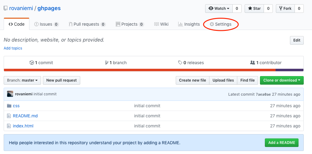
We’ll scroll down to the section called “GitHub pages” and publish the main branch by choosing it from the dropdown menu. GitHub will let you know once the site has been published:
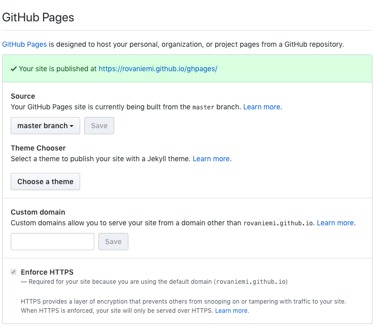
Now the site is live on the Internet, an we can simply navigate to it. The address is by default of the form username.github.io/repository.
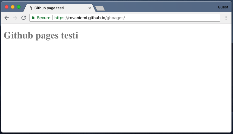
Now we have built a website, which is accessible to anyone using the Internet.
- Create a new repository on GitHub.
- Use the repository to create a CV website, where you write about yourself, your interests and your possible work experience.
- Take advantage of the things you have learned during this course. It might be a good idea to search for inspiration with for example the keywords "static website resumes". If you don't know how to do something, just try and Google how to do it.
- Push all the changes you make to GitHub. Try and divide the process into sensible sized commits; don't just create one big commit.
- Publish the site as a GitHub page, or using the department's server space.
The end
This is the end of the last part of the course. You should now have a basic understanding about the command line, Git and HTML/CSS. This knowledge will certaily deepen during your studies, as these are all important tools for a computer scientist.
Remember that HTML and CSS are both very versatile, and it may take a considerable amount of time to truly understand them. If you are especially interested in web development, or more specifically, front-end development, it’s a good idea to spend some time on learning HTML and CSS.
Here are some useful links for learning more about the subject:
- https://developer.mozilla.org/en-US/docs/Web/HTML
- https://developer.mozilla.org/en-US/docs/Web/CSS
- The HTML and CSS documentation made by Mozilla is a comprehensice guide to the principles of both languages.
- The Internet is also filled with questions about both languages, as they are so widely used. Don’t be afraid to ask Google if you have any questions, as it is likely that you are not the first one.
The end of the course
This is the end of the material for the Tools for CS studies course.
Take a break, and congratulate yourself for finishing reading the material. Then go back to the learning goals you can find from the beginning of this part, and see which subjects seem unclear to you. If you have trouble remembering something, check the material or the Internet for answers.
Finally, make sure to read the exam instructions before starting. Also remember to mark all the exercises you have done on Moodle, so we can use them in grading, and that you have enrolled on the course in Weboodi.
Thank you for participating on the course, and good luck with your studies! Google and fellow students will get you through anything :)